Photo Walk - Van Gogh Alive Exhibition and Walk
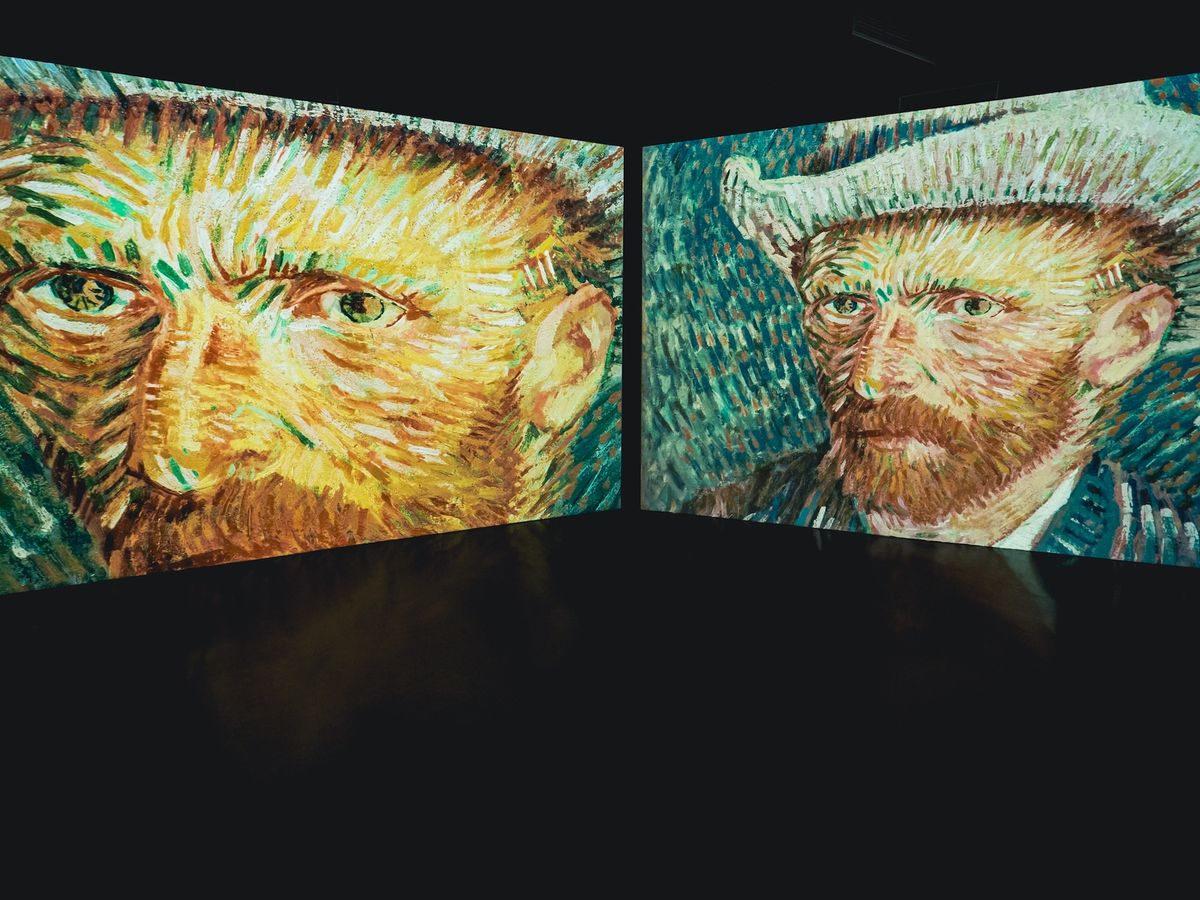
At the end of my post about the Tadao Ando exhibition, I mentioned that soon I would be visiting the Van Gogh Alive exhibition. I did end up going, and though it wasn’t really what I was expecting, it was still interesting.
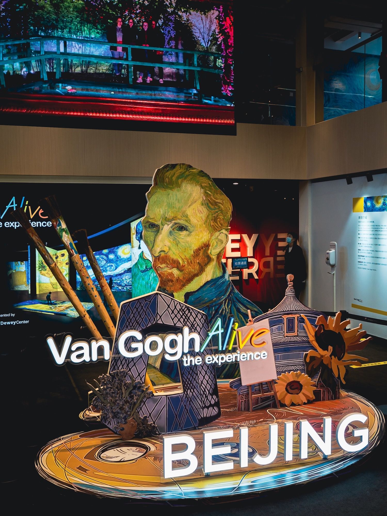
But for me, even more interesting was the walk I did around the area after I left the exhibition.
When I say that it wasn’t what I was expecting, I mean the exhibition itself was more like an immersive experience rather than just an exhibition of his paintings. Of course I would have realized that if I had done any research before going 😂
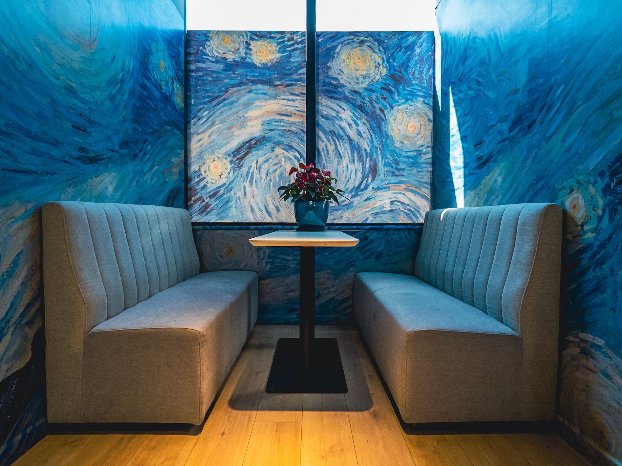
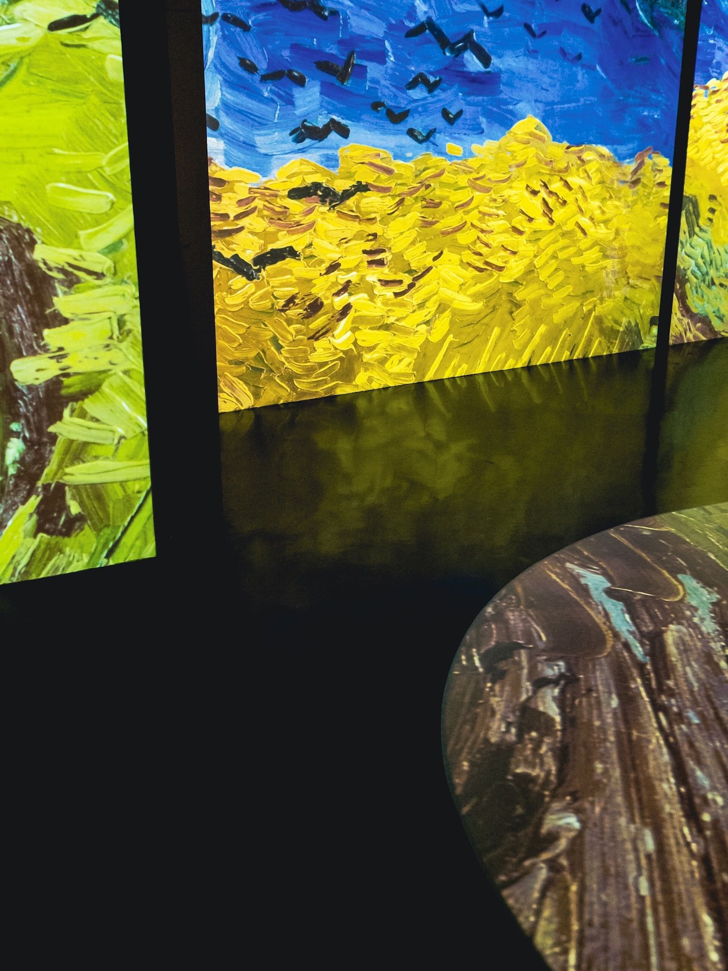
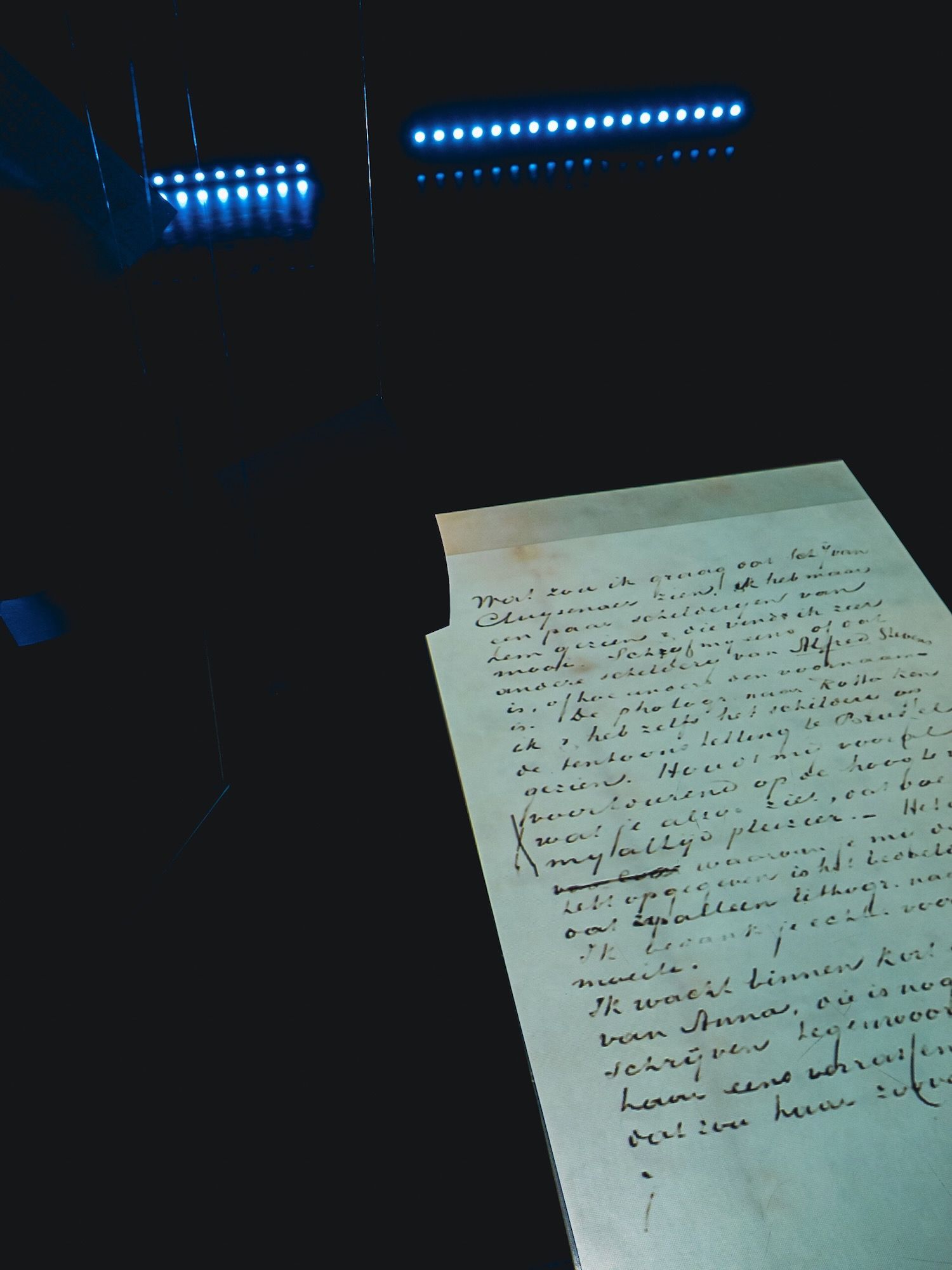
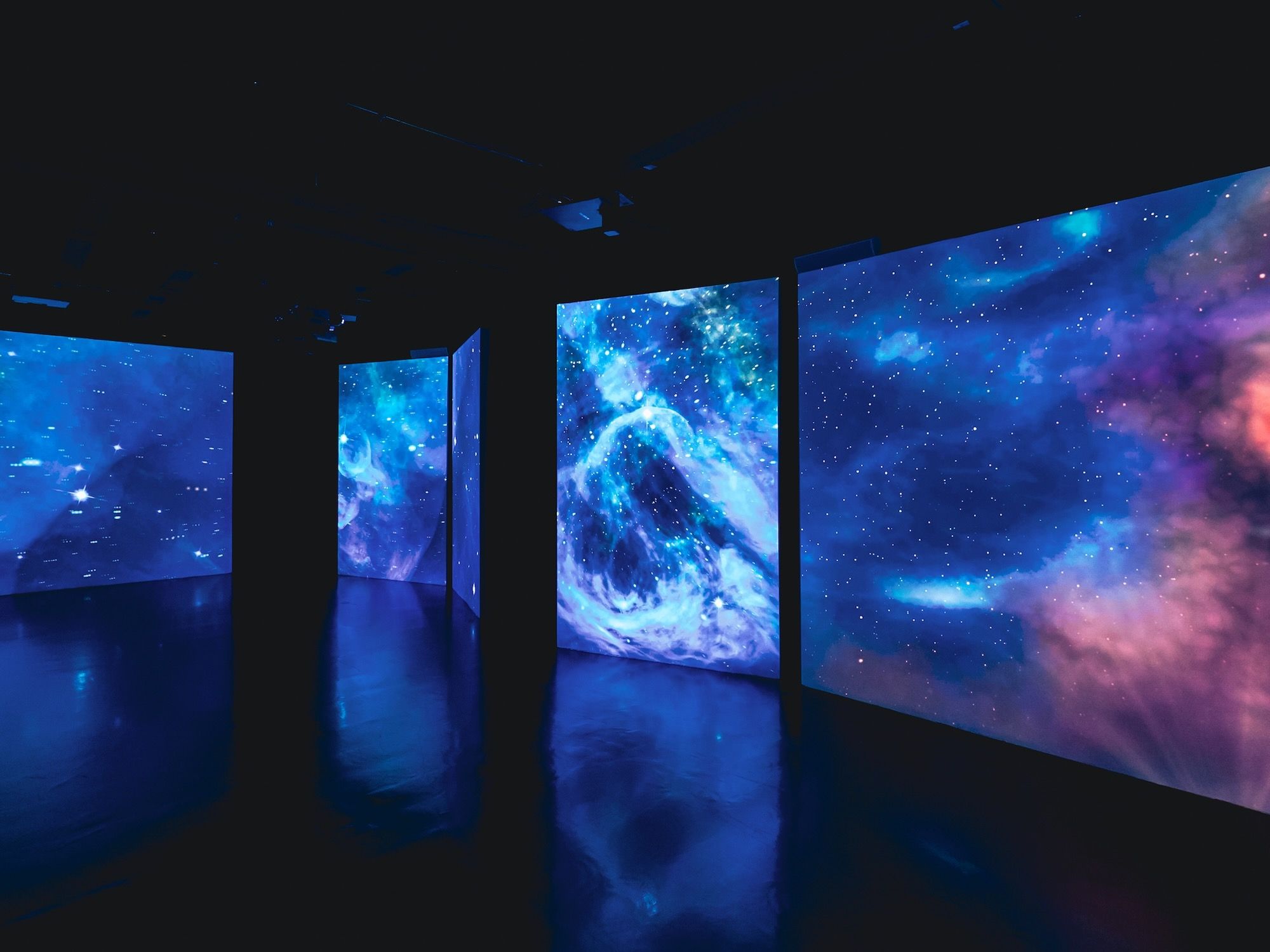
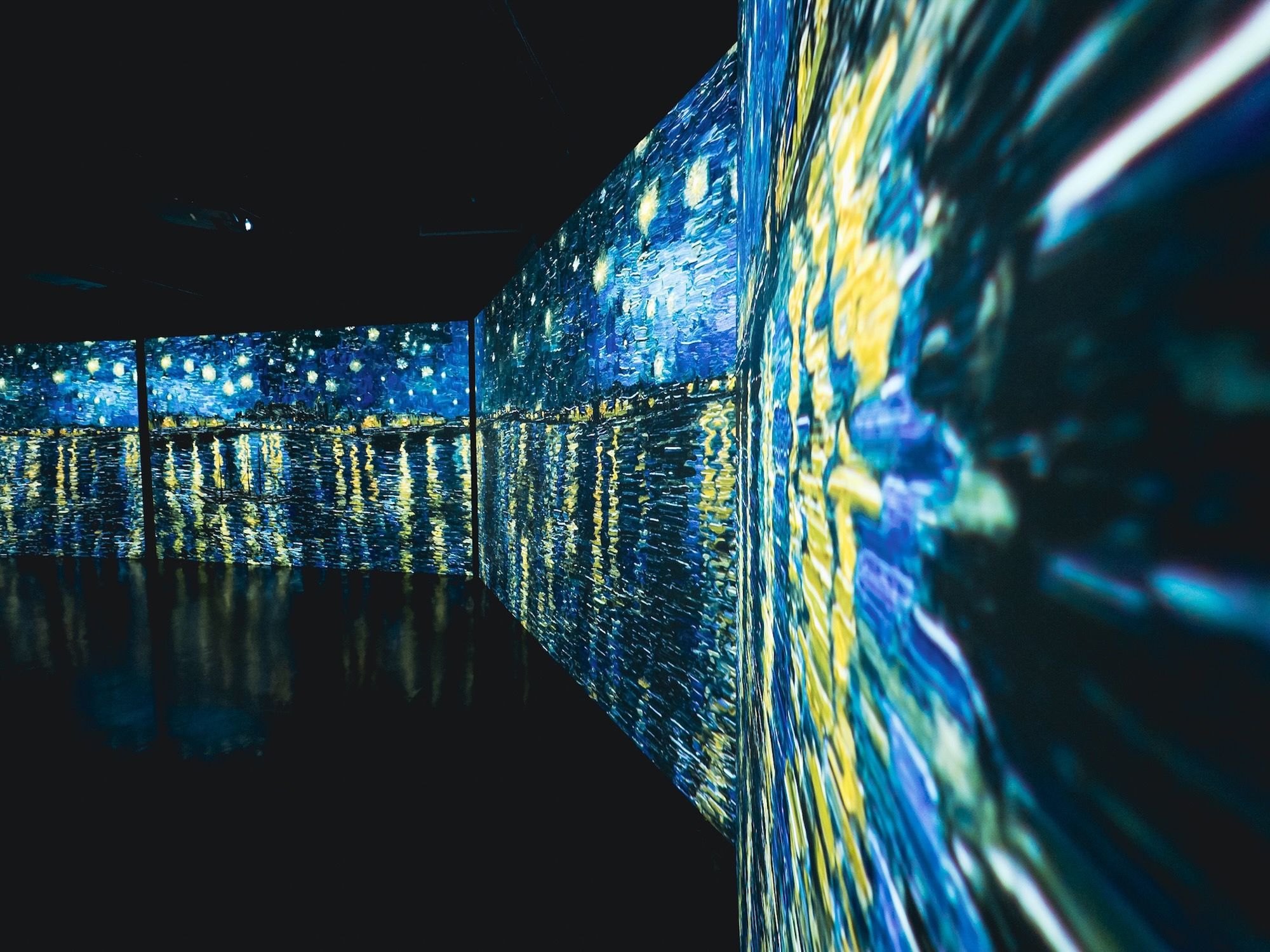
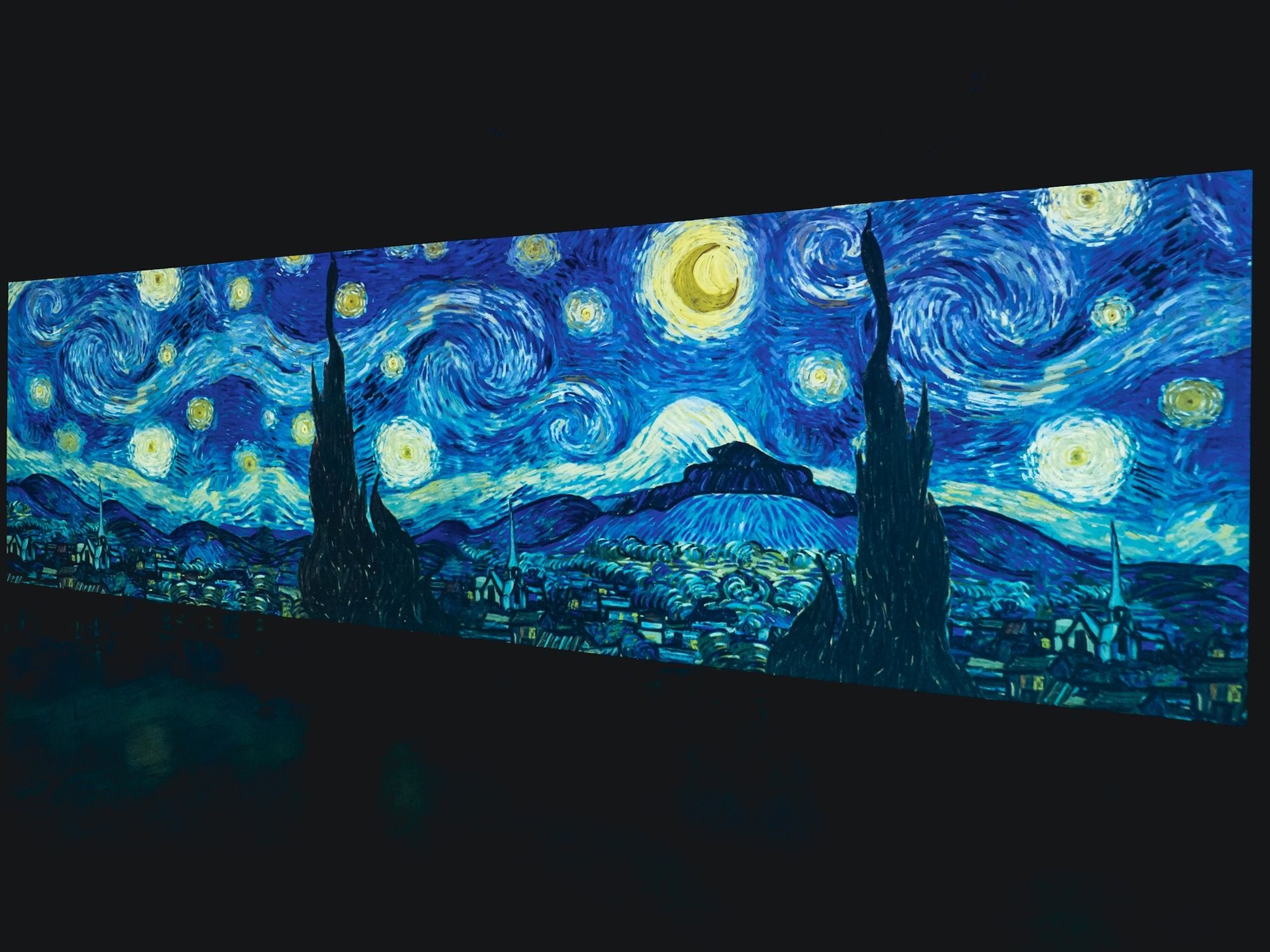
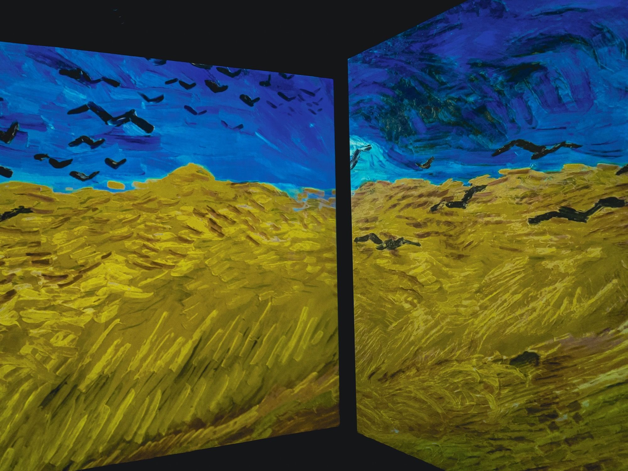
But for me it was still good. Anytime I have my camera with me is always a good time. Here are some photos from the exhibition…
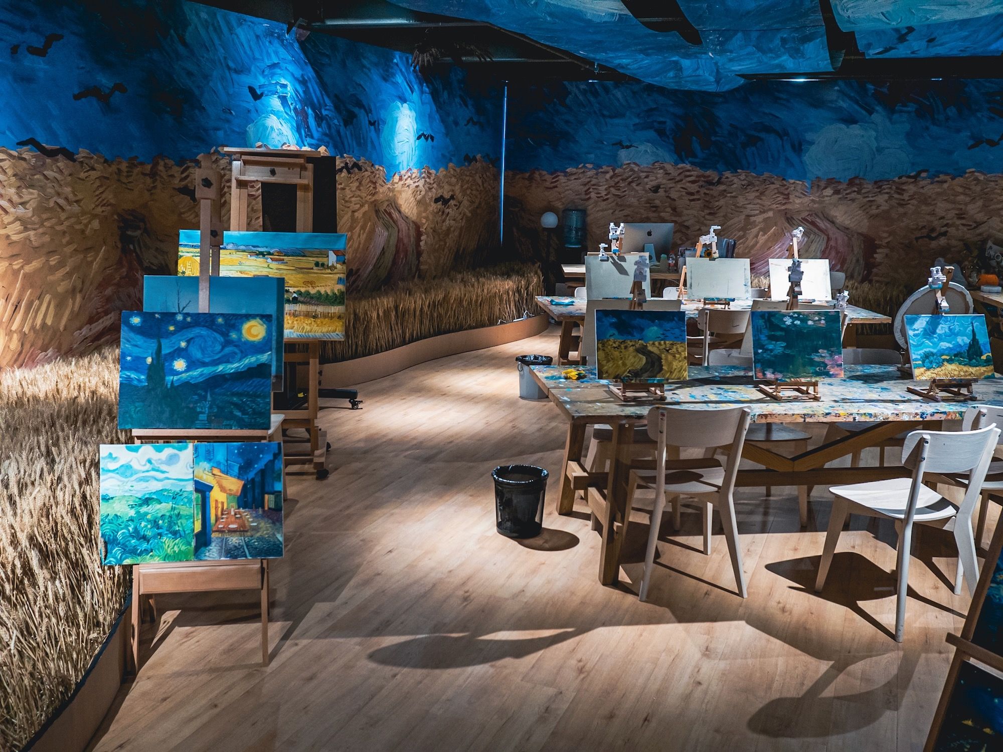
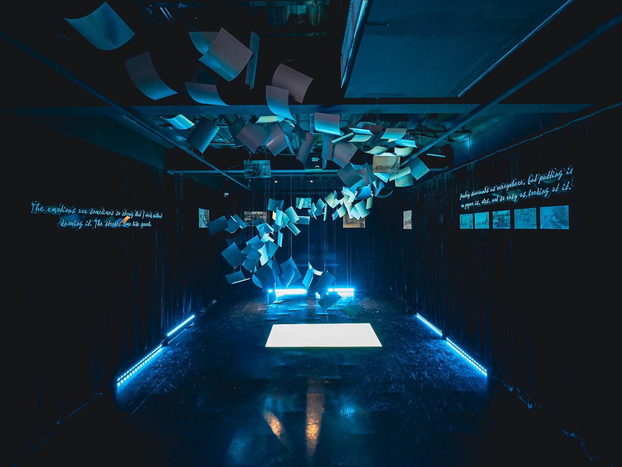
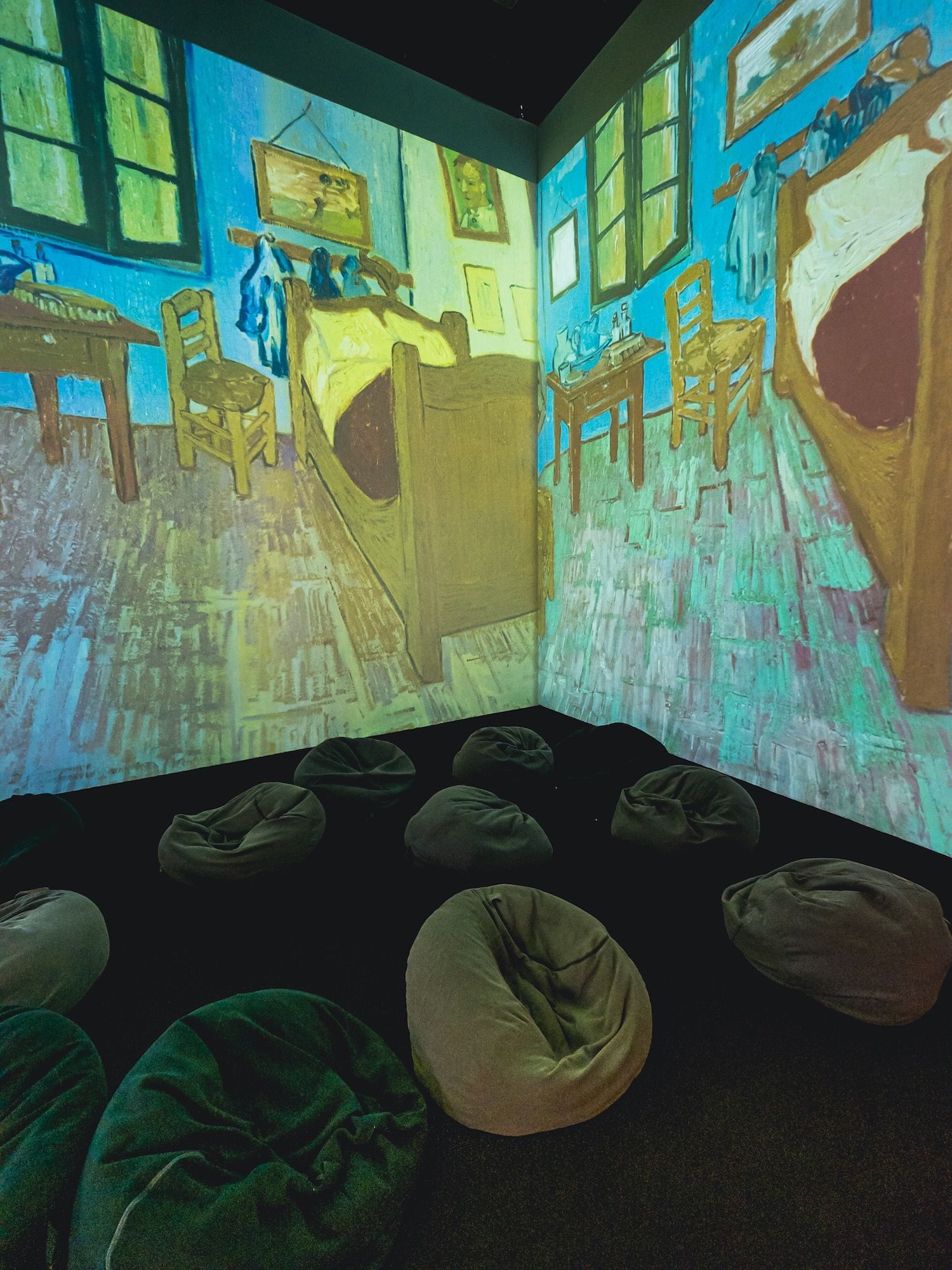
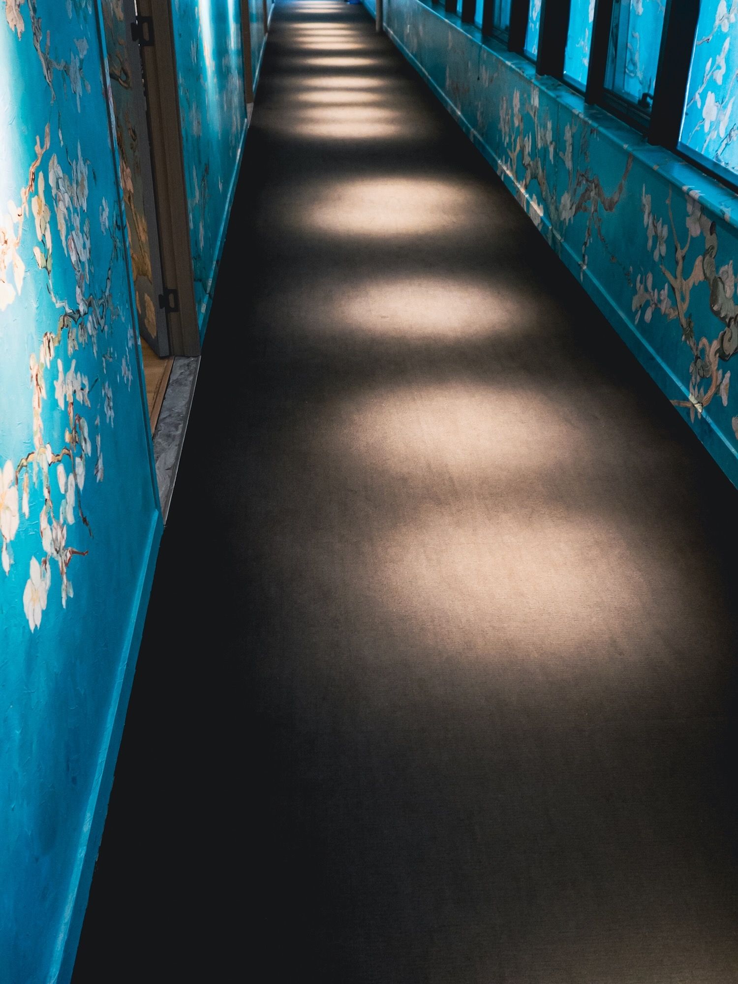
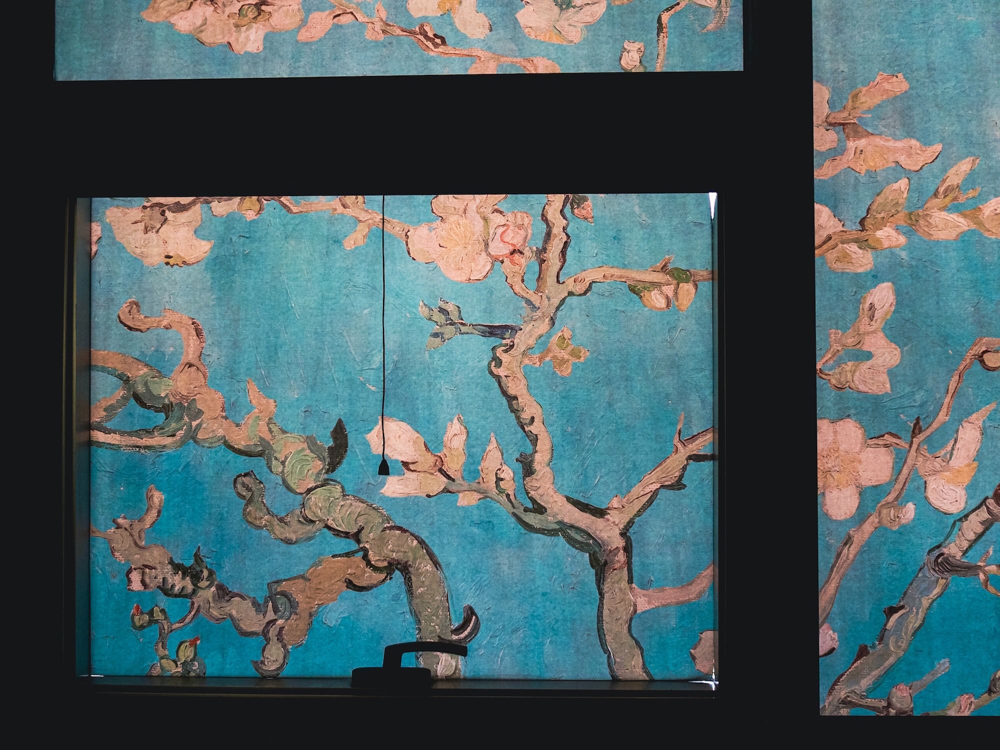
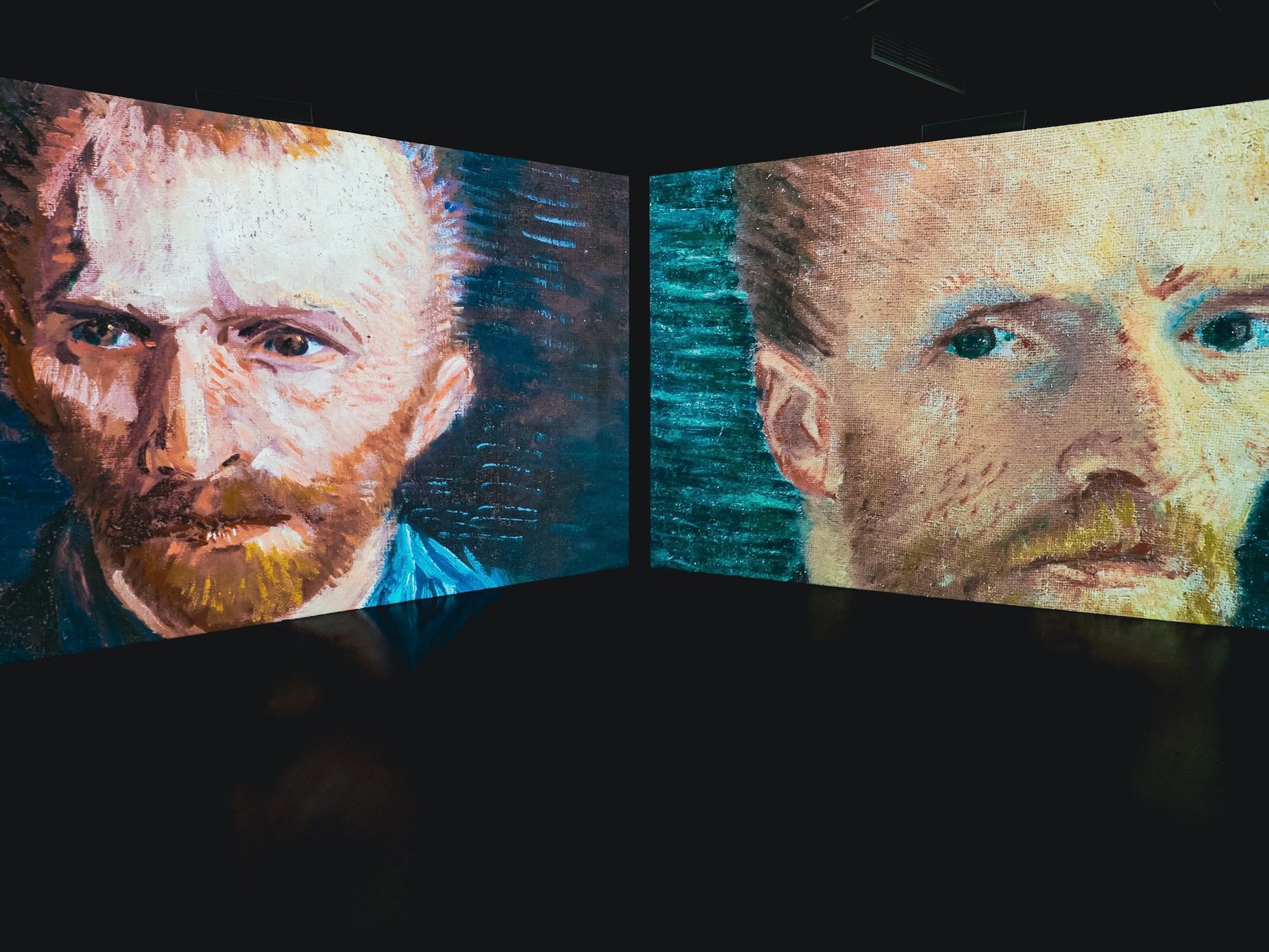
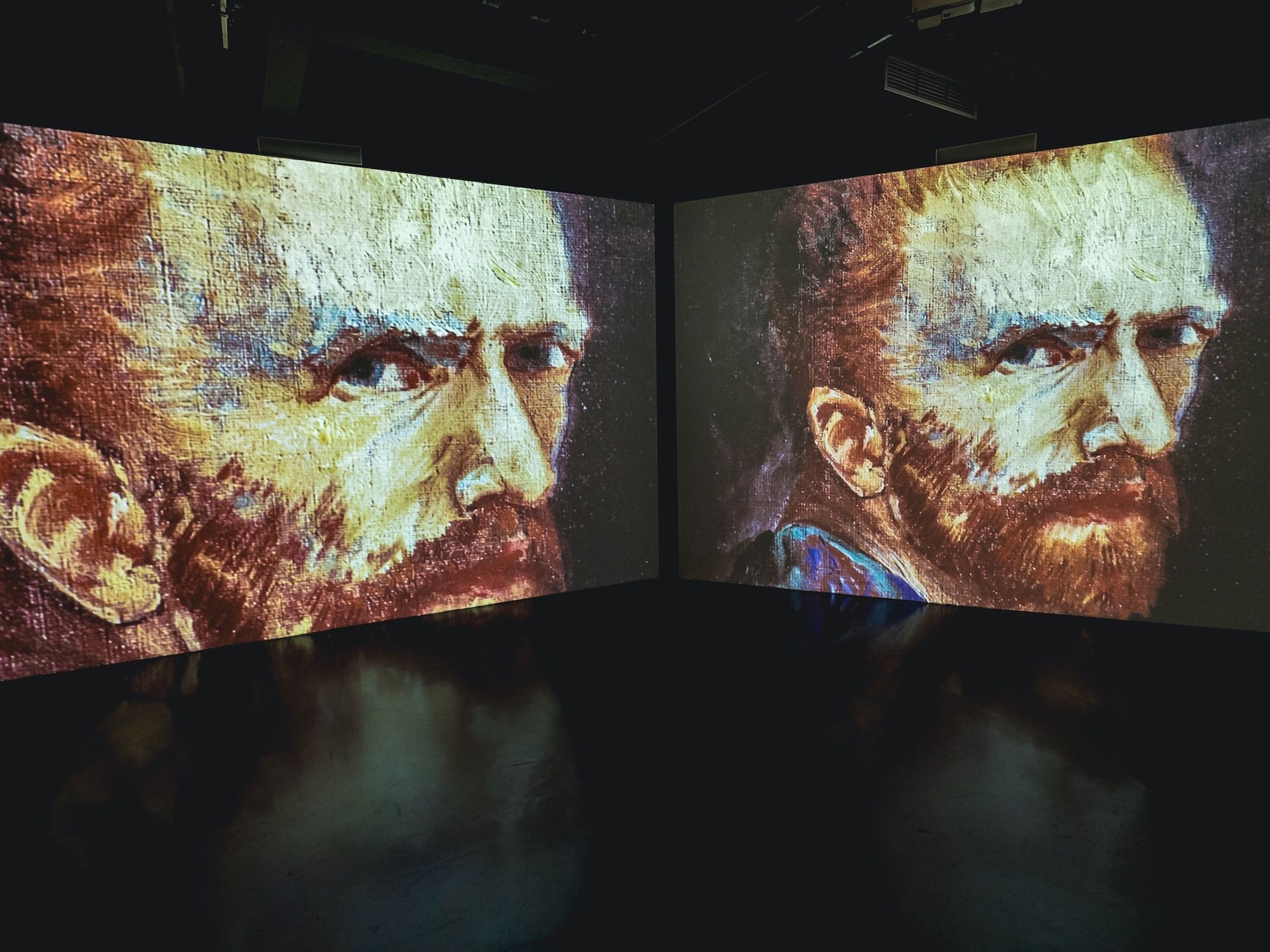
These large screens kept playing different videos over and over again. I spent way too much time waiting for an ideal time to take interesting photos I thought would look good on both screens.

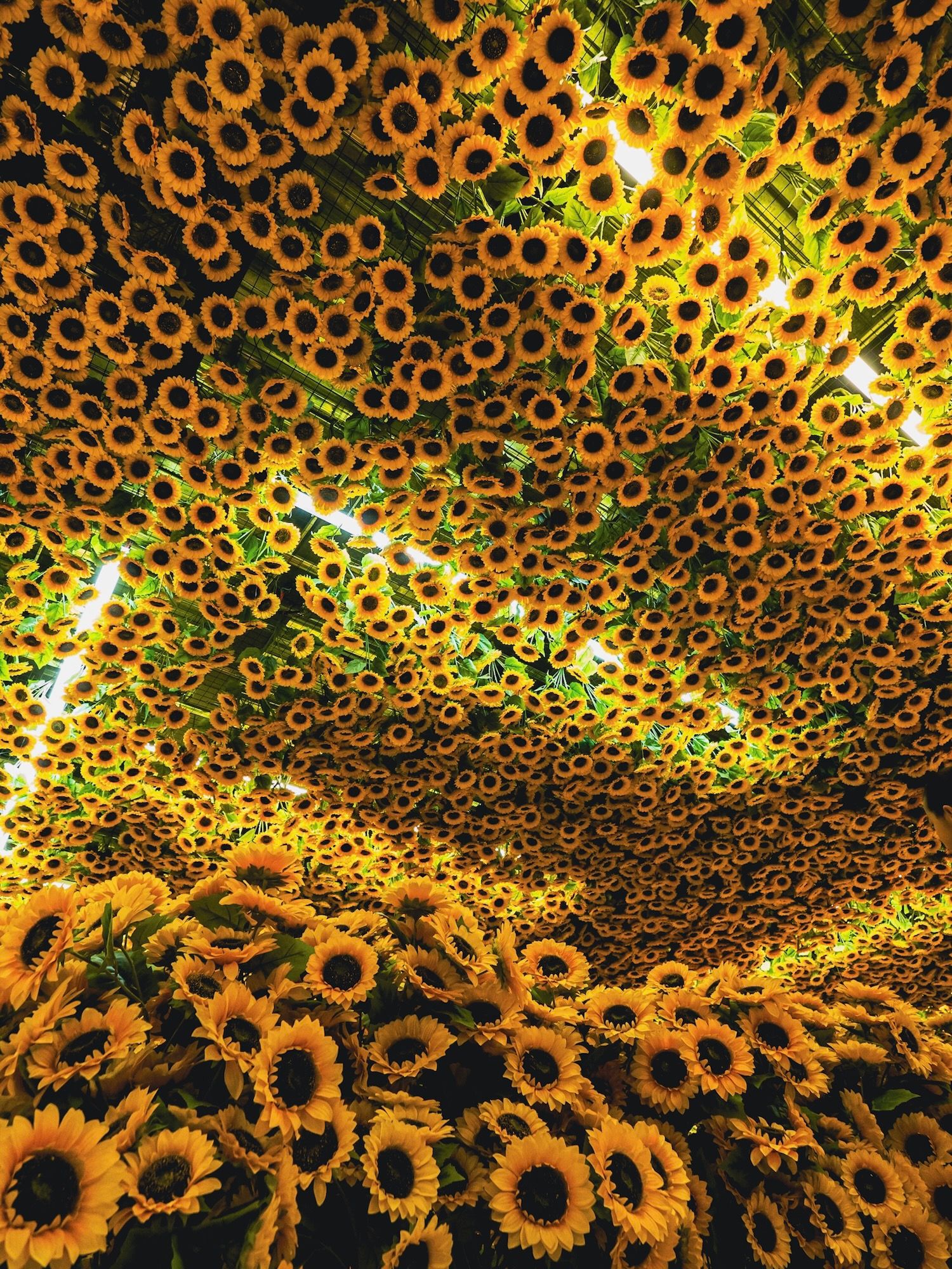
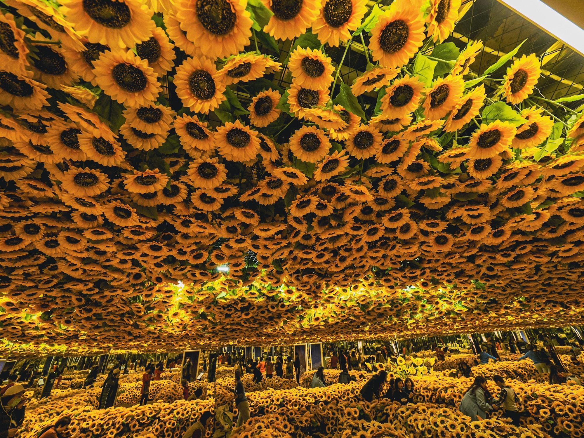
This room was packed with people, lots of selfies and groups doing videos 😂 I switched to my wide angle lens and composed from below, looking up so I could hide all the activity.
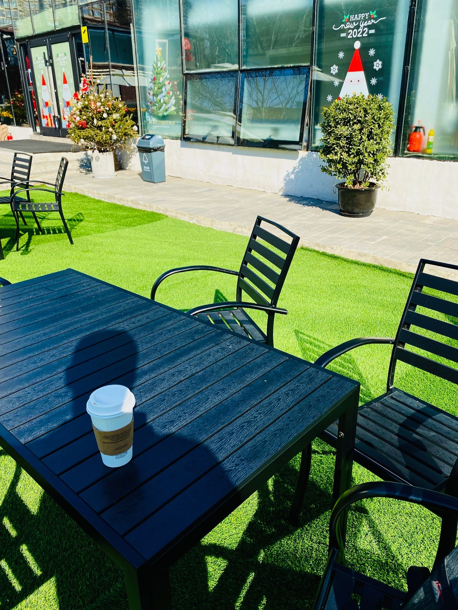
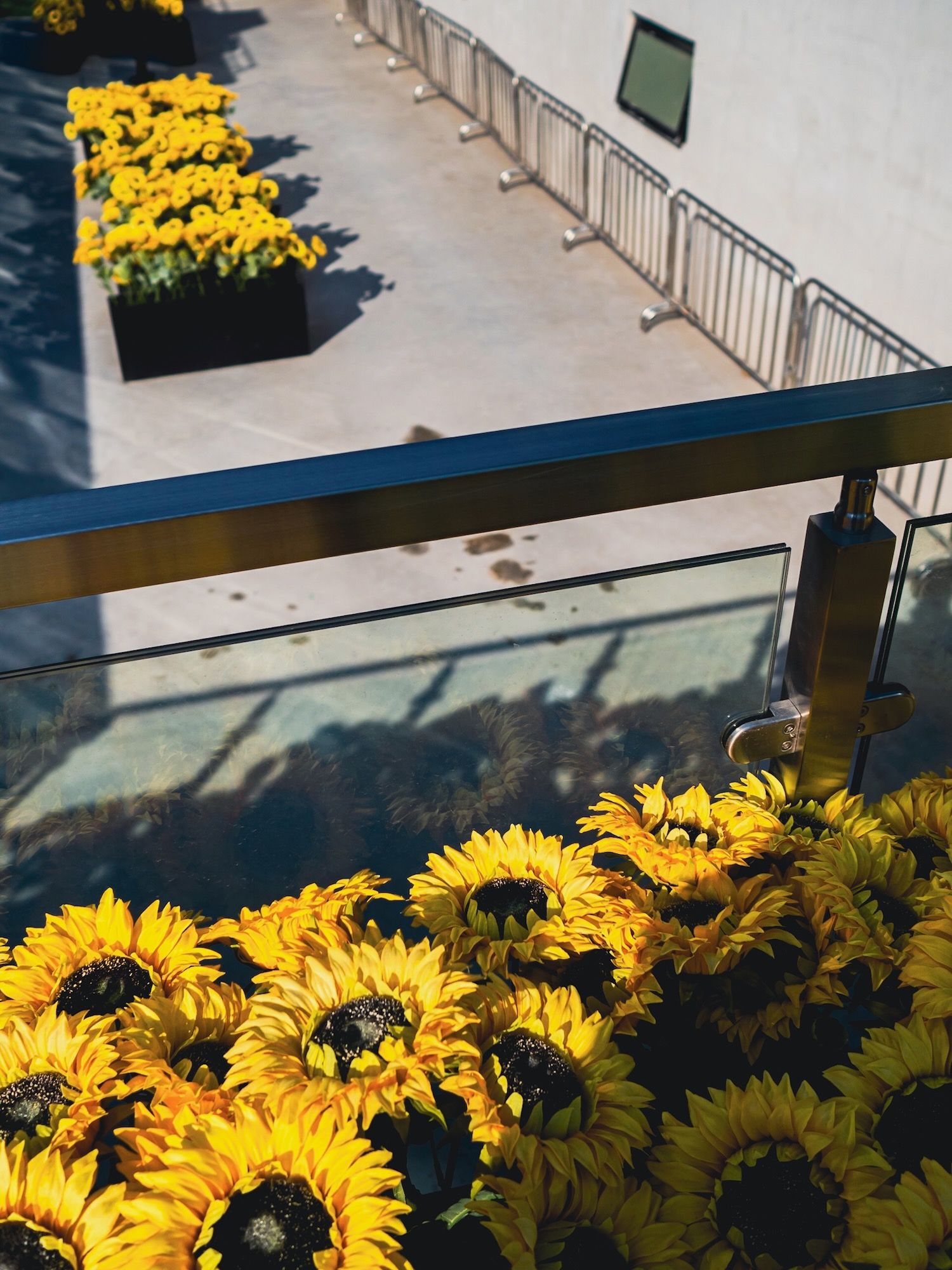
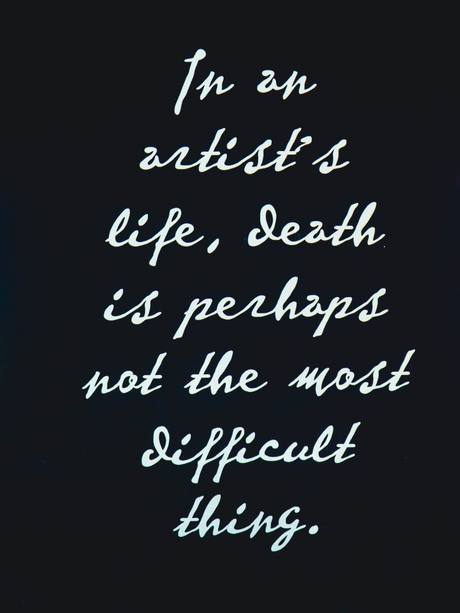
Although it was February, it was a very warm and sunny day, perfect for taking a break outside with a nice coffee.
Walk After the Exhibition
As I mentioned earlier, the weather was so great, so after leaving the exhibition, I walked around for a while and took some photos outside.
This area is basically the same area as I was in for my first photo walk with my new camera.
The late afternoon light was incredible.
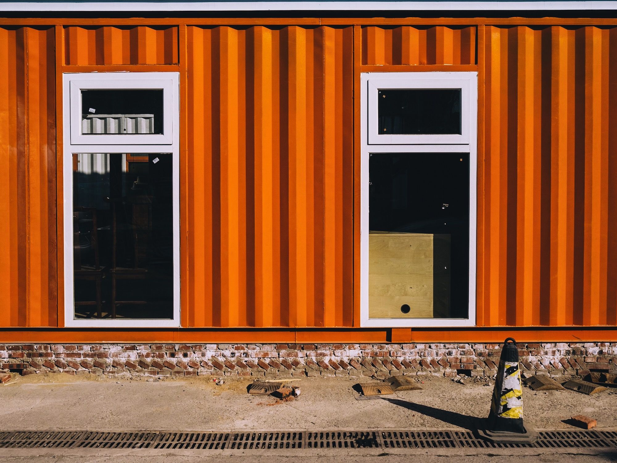
This one it was obviously the colour that first attracted me. But I also liked the grill in the foreground along with the pylon.
For these kinds of photos sometimes I question my composition. Is it better to center the two windows in the picture frame? In this case, I placed them a bit off-center so the pylon wasn’t too close to the edge.
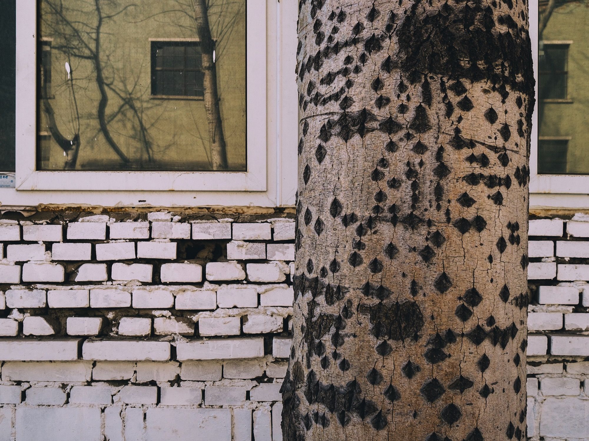
For this one I liked how the colours and pattern on the tree trunk were similar to the bricks in the wall in the background, and also had a randomness to it. And then throw in the reflection. And how the tree is completely isolated in the middle section (it doesn’t cover the window on the right side, though I would have liked it more centered).
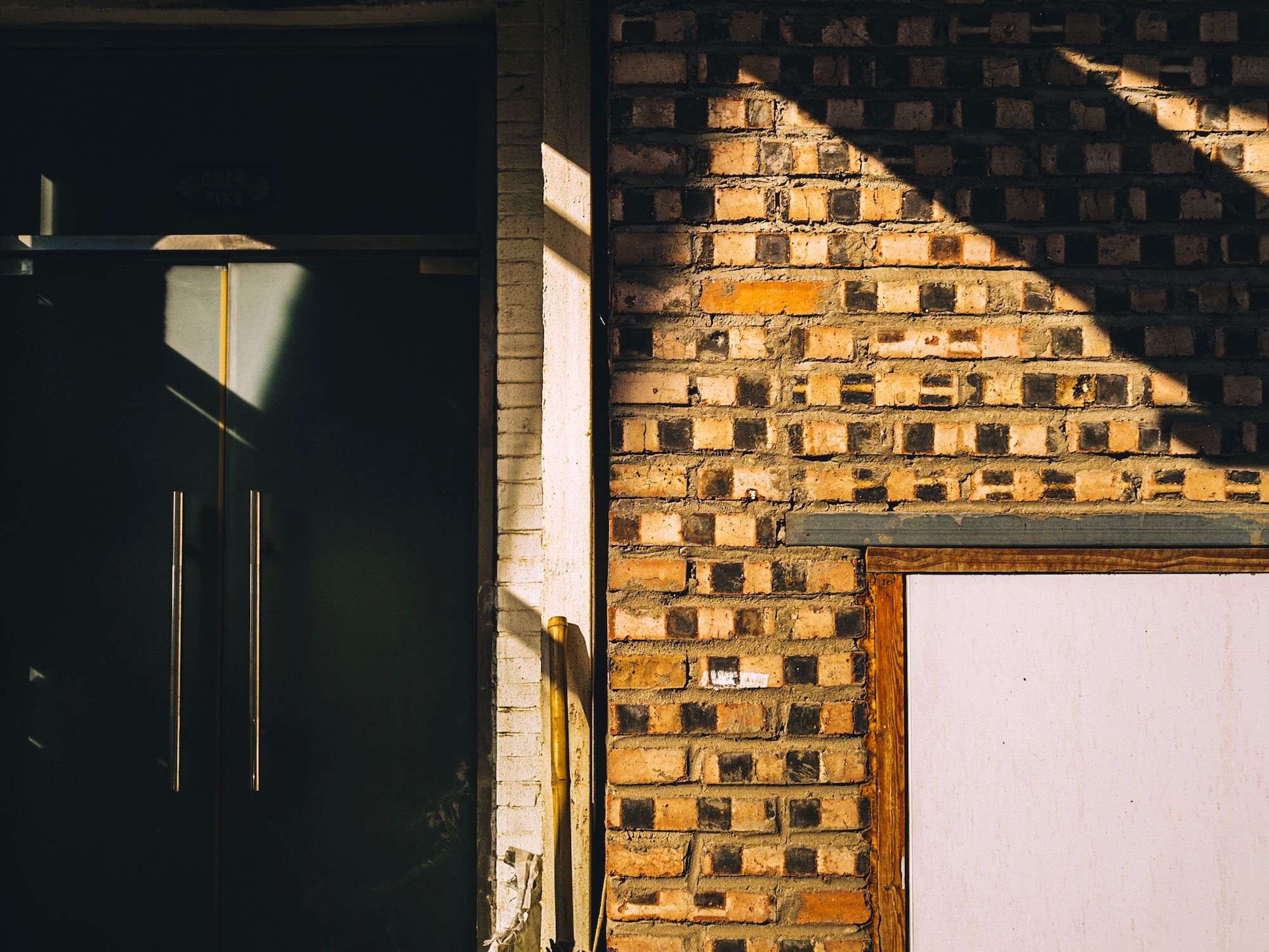
This one…I like how there are multiple shadows at the same angles, on the left, middle, and right sides. The door handles match up with the broom in the middle. I sometimes like how it’s hard to know whether it’s actually two photos or just one since the left and right sides are so different.
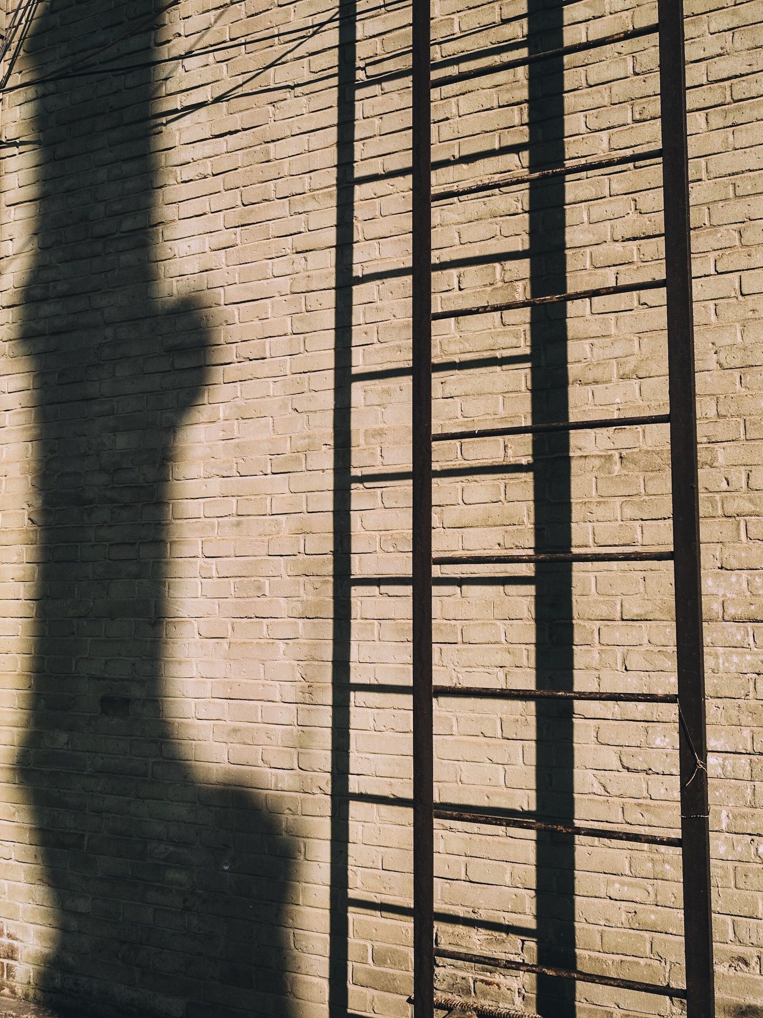
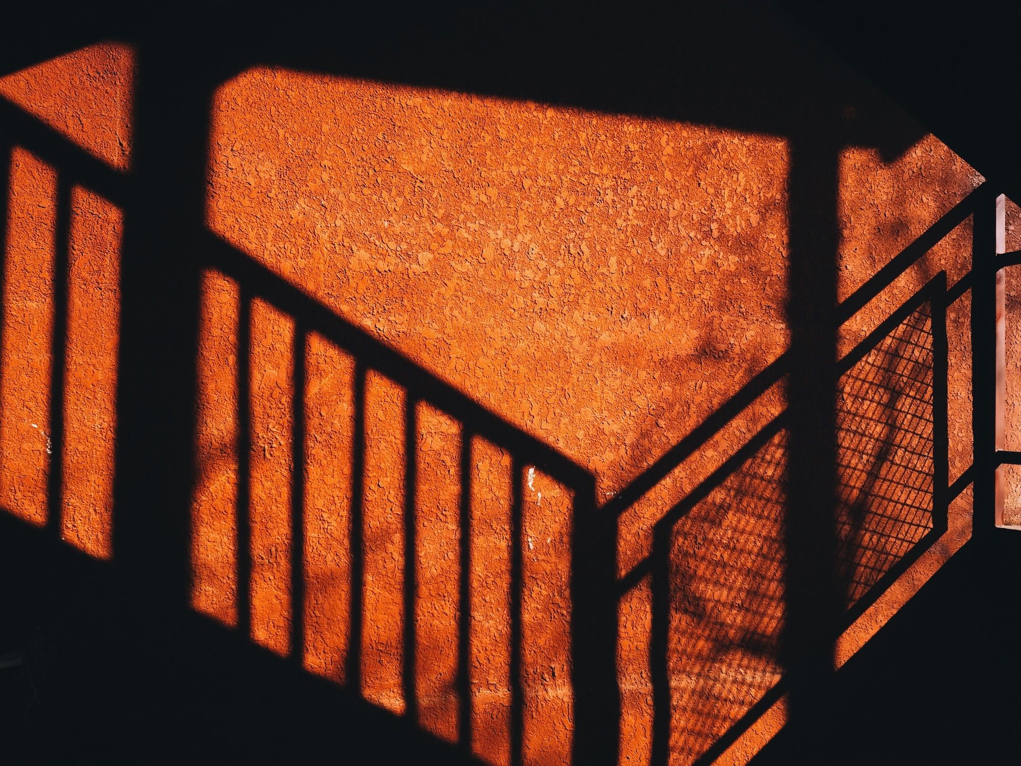
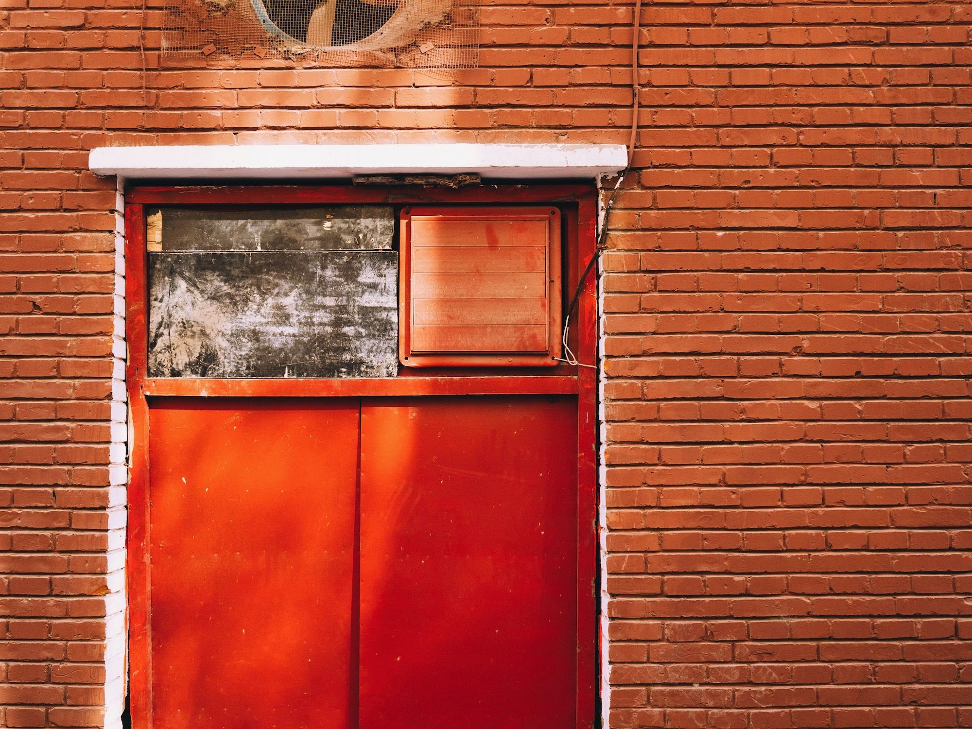
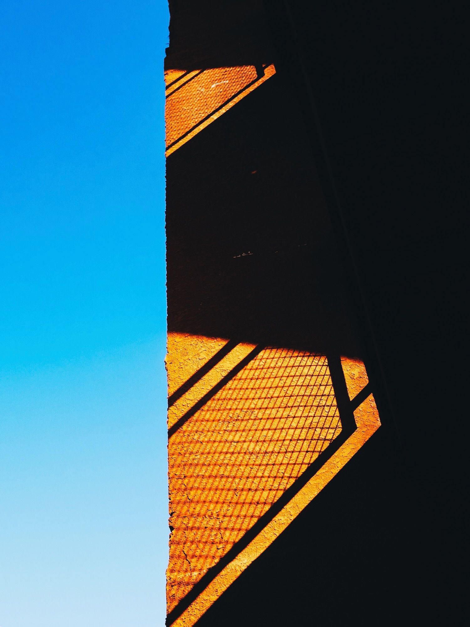
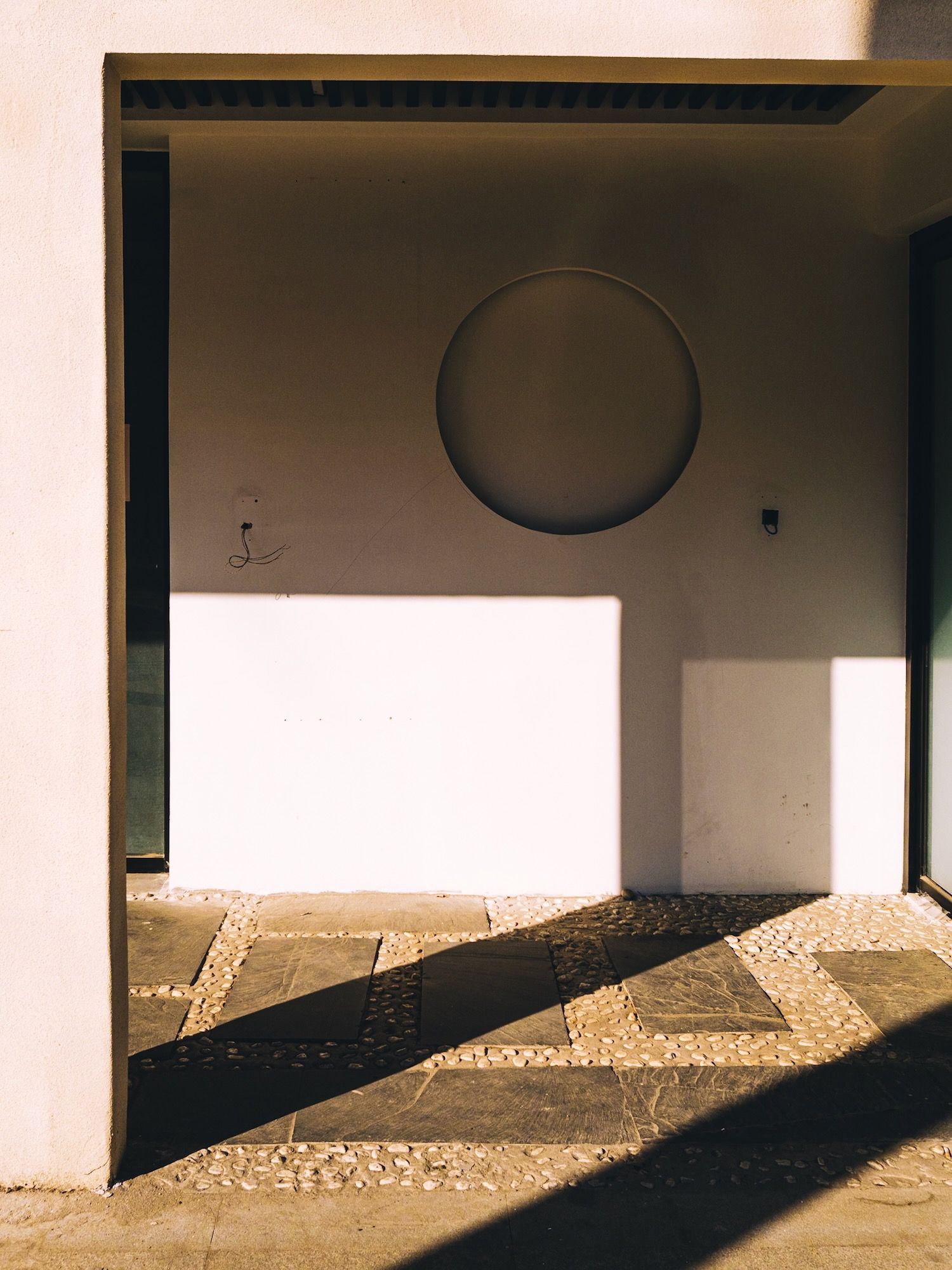
This one I just liked the light and dark, and how the shadow kind of leads to the circle. And how the light switches or whatever they are, are isolated in the dark area.
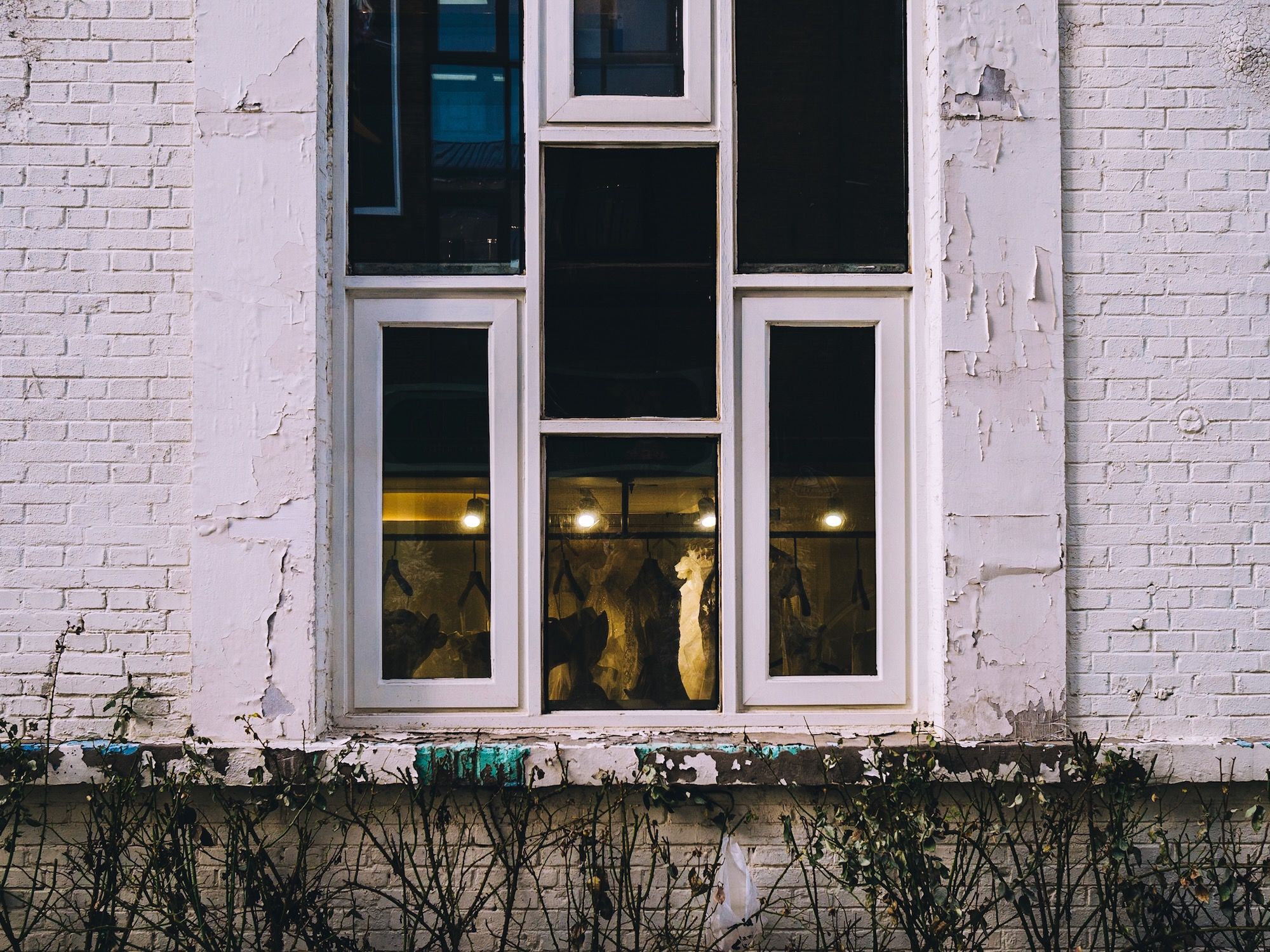
Here I liked the symmetry of the windows, though in the top windows the reflections are different, which kind of throws the symmetry off. And I wanted to line up the lights in the bottom windows better, but then the symmetry would have been off.
In this photo, I contemplated just showing the sky and not the tree branches in the top, but I think it’s nicer with them included.
This one had some good symmetry, and I liked the empty space in the bottom half.
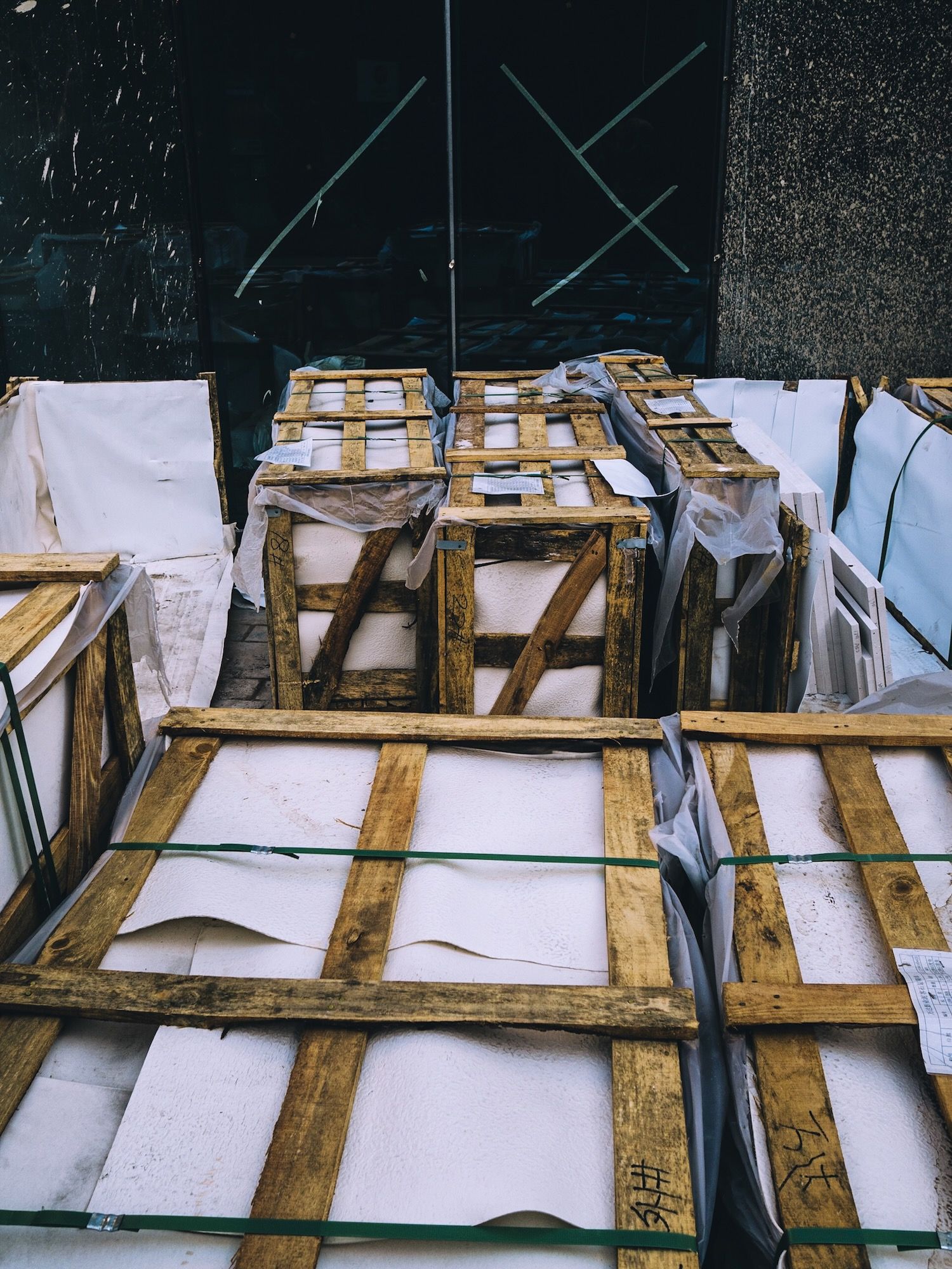
Here I was trying to do something with the slats of wood reflecting in the door mirroring the tape on the door, but it didn’t work.
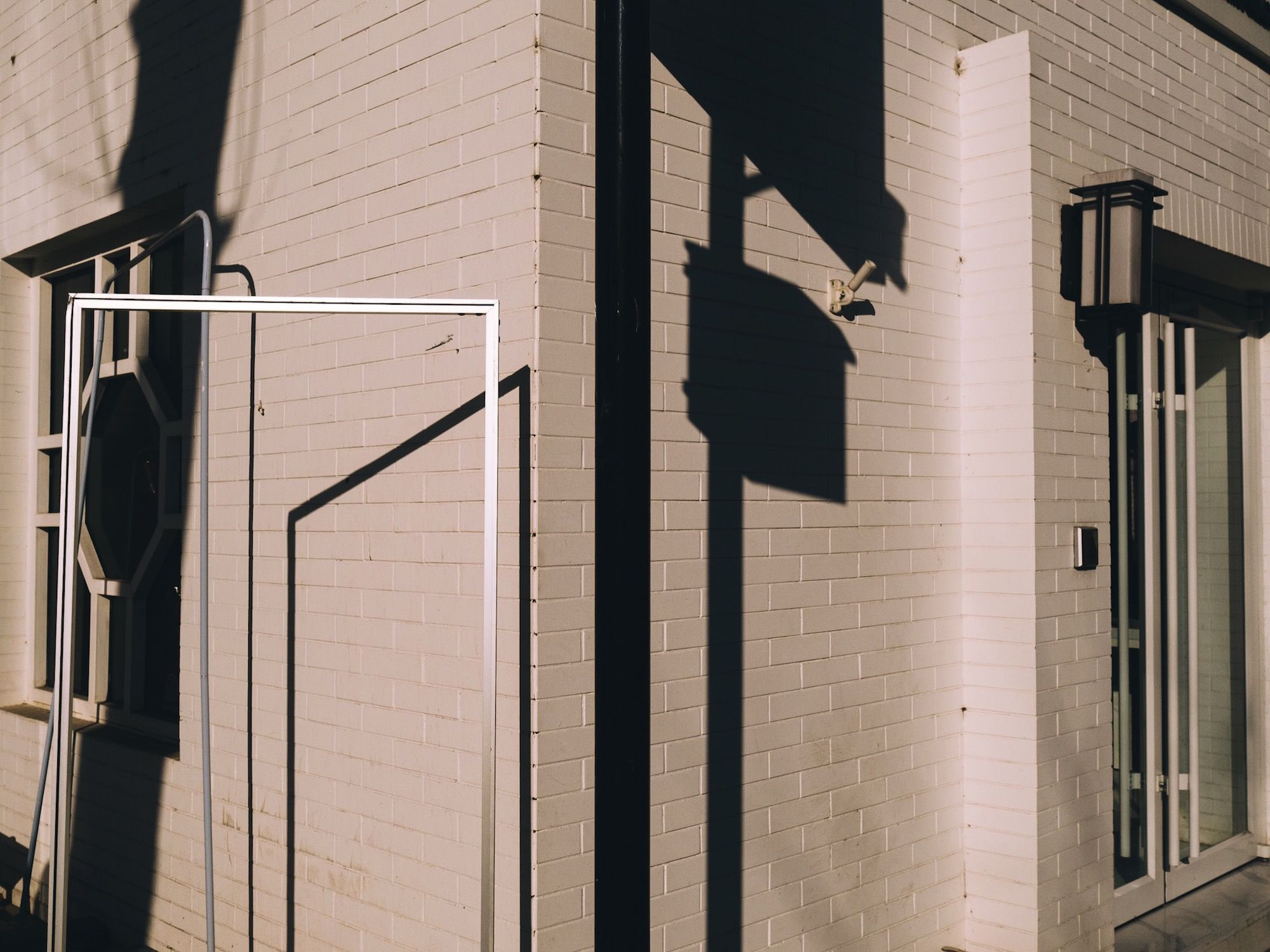
For this one I was initially drawn to the white frame on the left side and its shadow on the wall behind it. Looking at it now, maybe I would have moved to my left a little bit so the shadow would have been inside the frame.
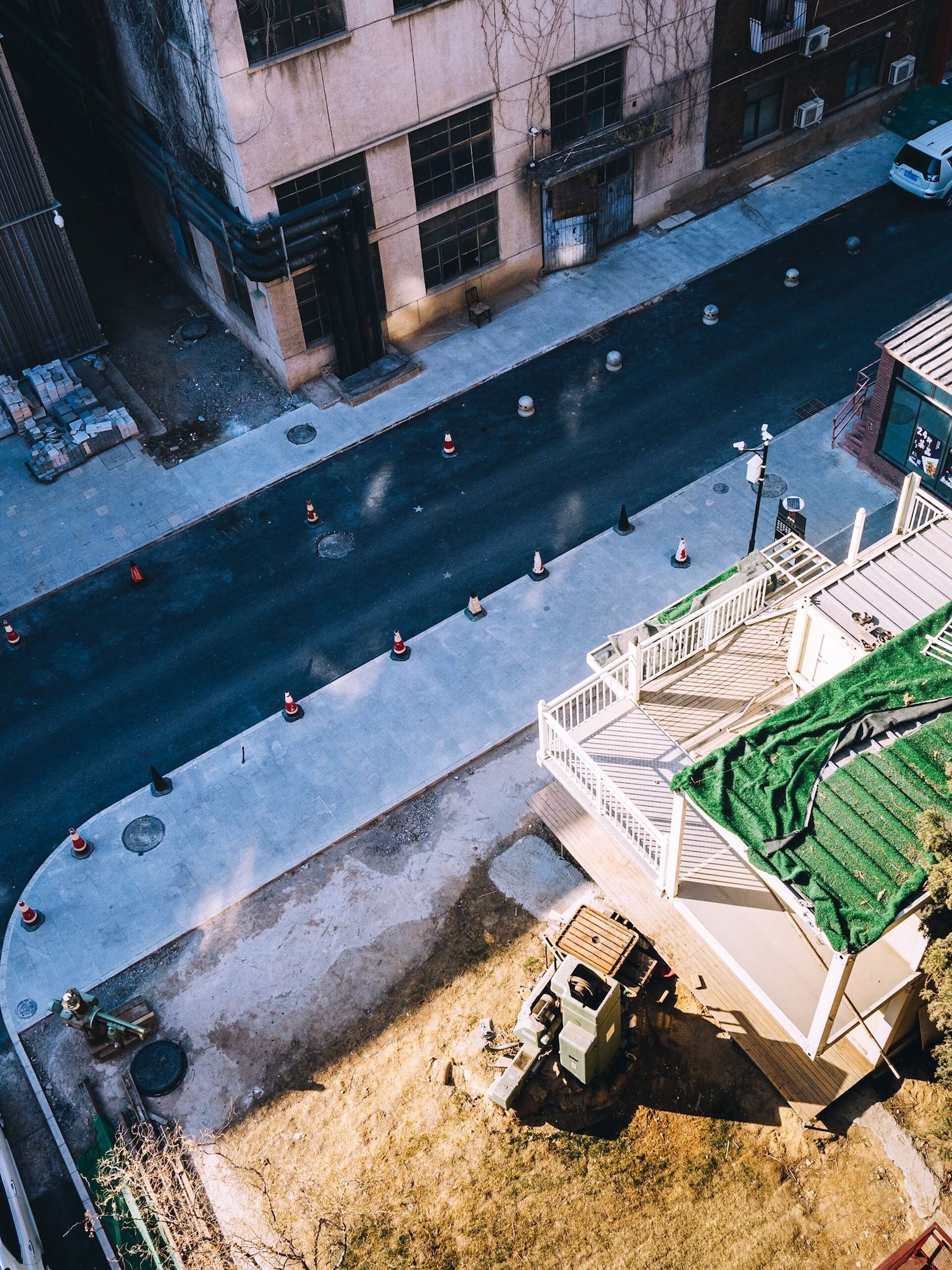
I wanted to make something cool here, but I totally failed. I was attracted to the curve of the road and the line of pylons. I took a few photos from this location, but nothing worked out.
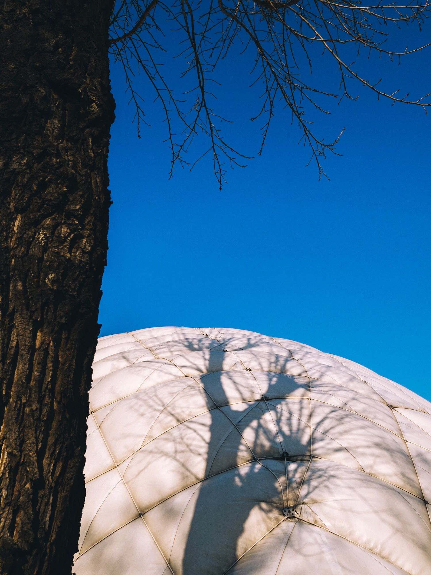
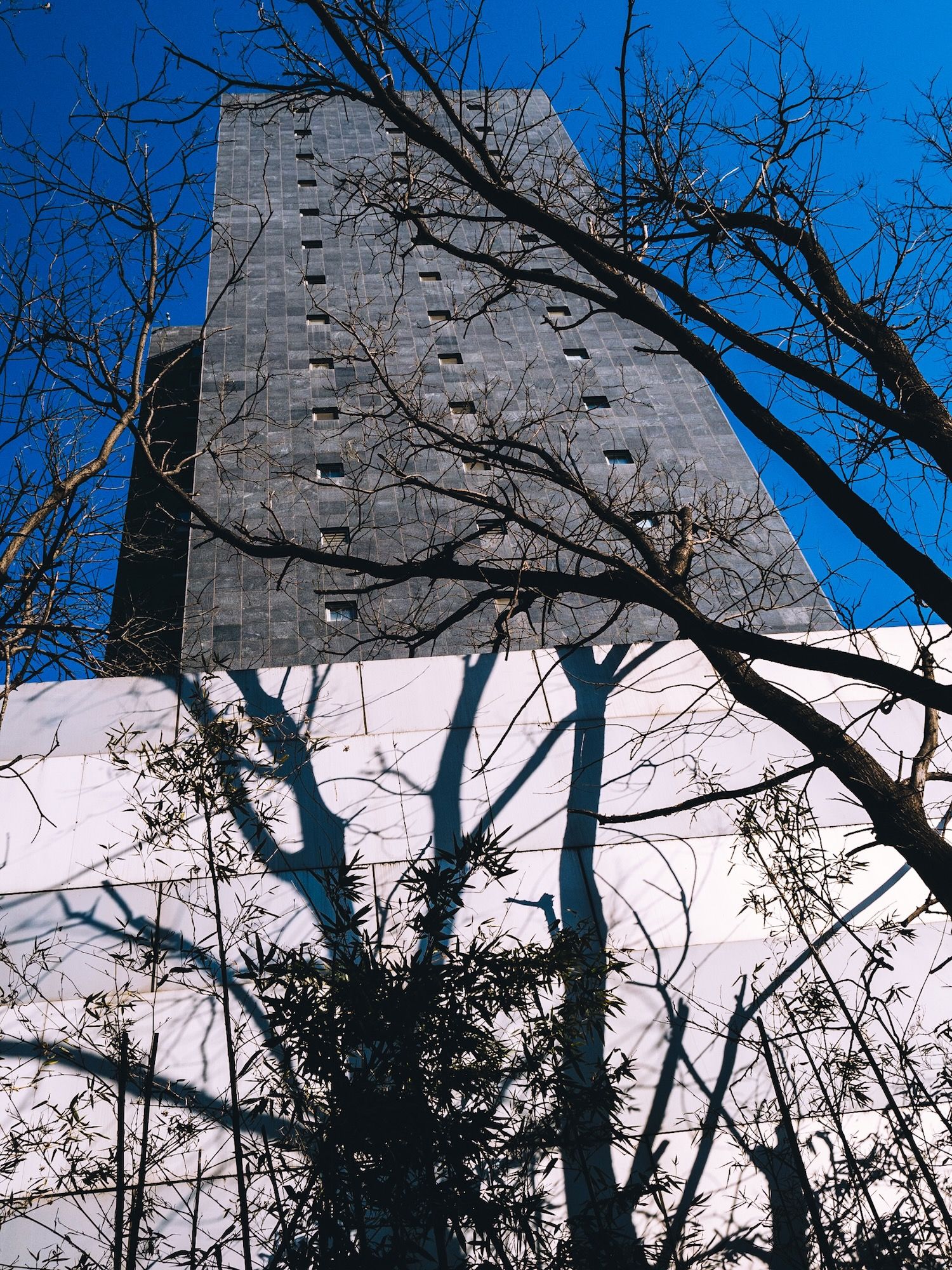
This one has a few things going for it that I like. First of all, some nice shadows. I also like the stark blue sky and the white wall. I was hoping to line up the shadows of the trees with the line of windows of the building.
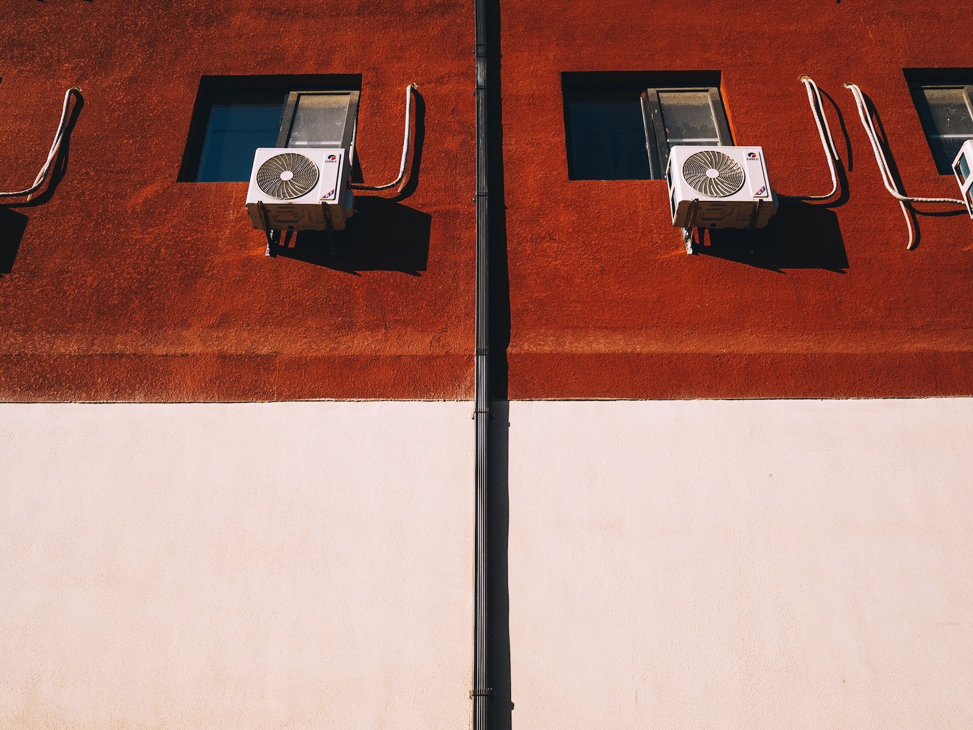
This one is nothing special, I like the rust on the right side, but the white bag or whatever it is on the bottom right bothers me. Maybe I should have moved it out of the way. I could crop it out, but then I would lose the rust. On the left side I like how the wall isn’t completely flush so it adds a bit of depth. I also like how the light showing on the wall is kind of self-contained between the black on the left and the rust on the right.
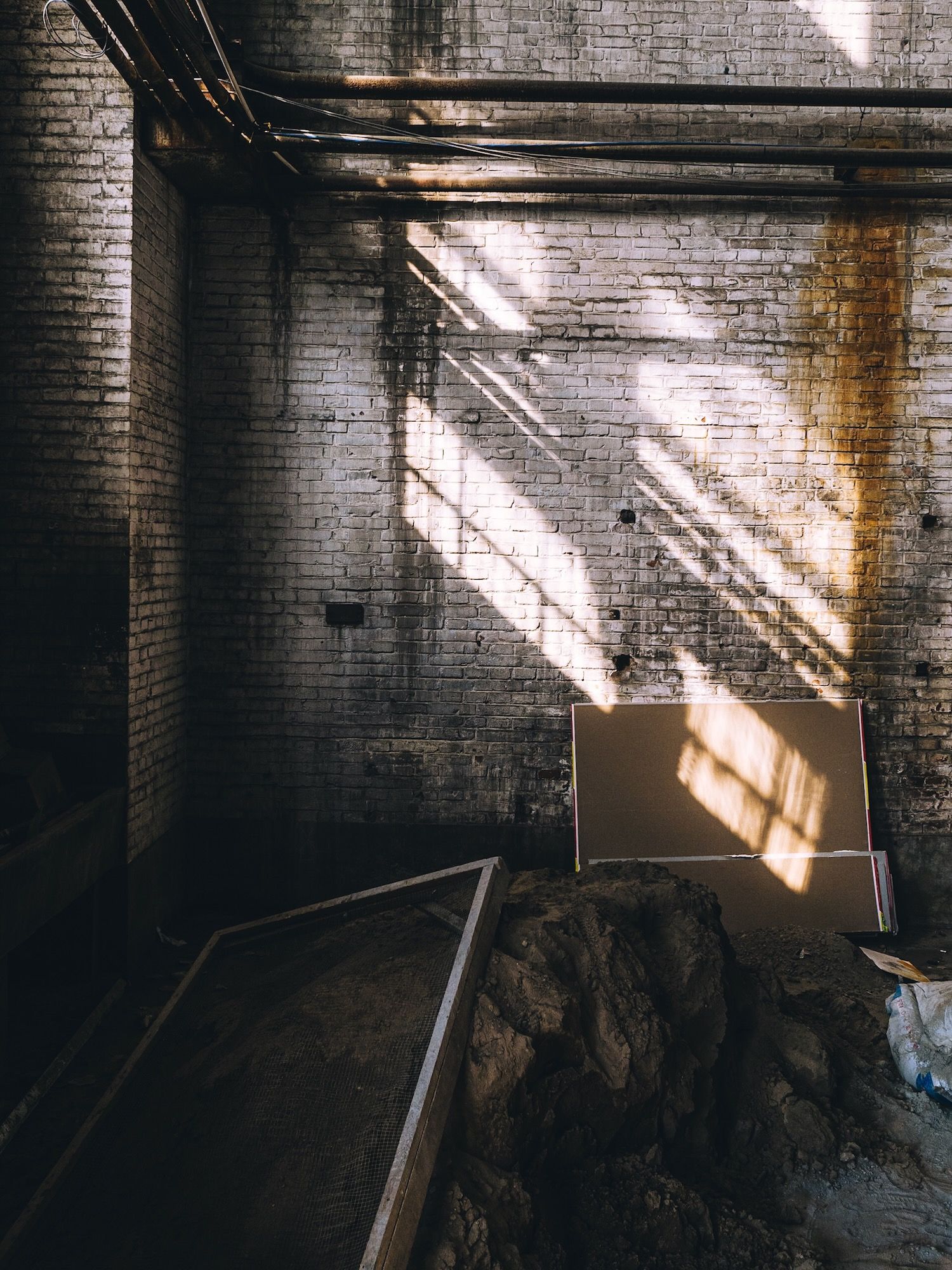
Photo Walk Finished
All photos were taken with my Olympus OM-D E-M5 Mark III and edited with Adobe Lightroom.
On my next photo walk, I walked around a bit in Beijing’s CBD area. Stay tuned!
I would love it if you followed me on Glass or maybe even on Threads.

And if you want to keep up to date with my latest posts, please consider subscribing to my free newsletter, you can join below.


